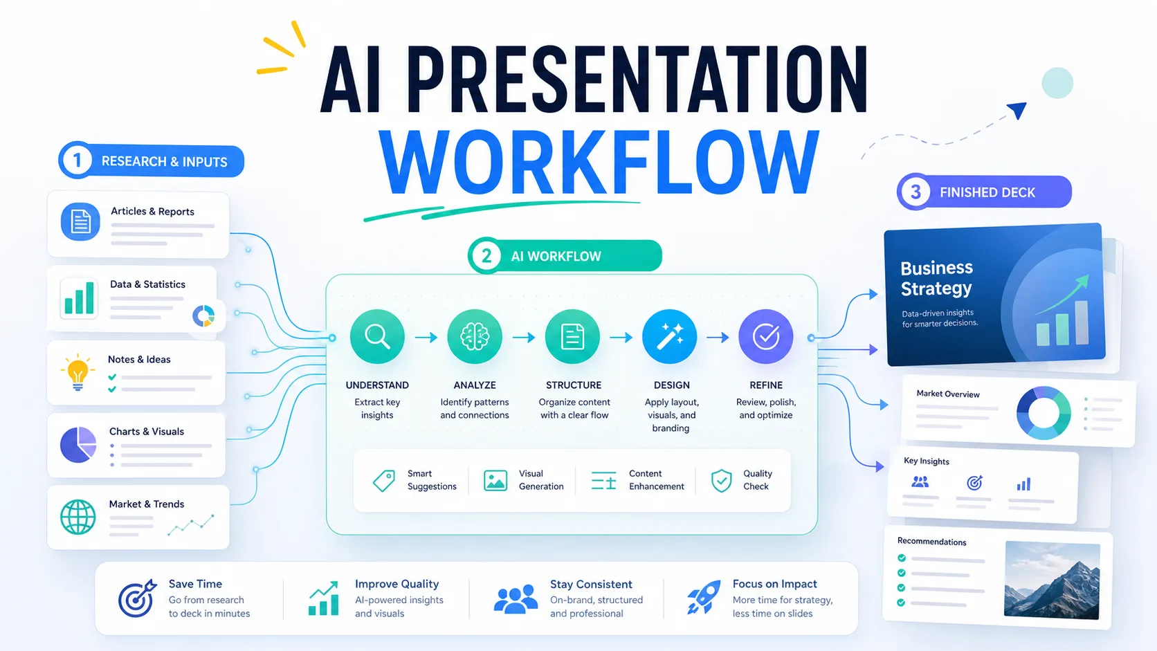
Image to Prompt: Turn Visual References into Presentation Styles
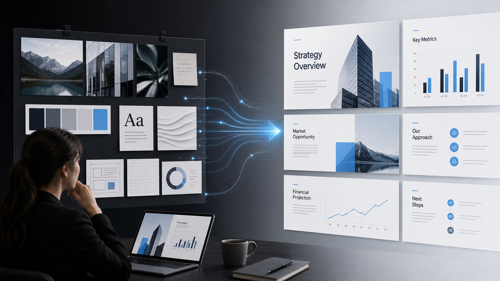
You have seen the perfect visual reference: a landing page with elegant spacing, a report cover with a premium color palette, or a slide screenshot with exactly the mood you want. The challenge is turning that visual instinct into words an AI presentation tool can actually use.
That is where an image-to-prompt workflow helps. Instead of saying “make it modern” or “use this style,” you translate a visual reference into clear presentation design direction. A strong prompt can guide color, layout, typography, visual density, chart treatment, and slide hierarchy. But for professional decks, the goal is not to copy an image. The goal is to convert visual inspiration into a usable presentation style system that supports the message.
Why Image-to-Prompt Matters for Presentation Design
Presentation design depends on language. If your instruction is vague, the output will often be generic: clean but forgettable, stylish but hard to read, or decorative without business purpose. Image-to-prompt workflows give teams a better way to describe what they want.
This matters because most people know what they like visually before they know how to explain it. A founder may want a pitch deck that feels sharp and investor-ready. A consulting team may want a market research deck that feels analytical and premium. A sales team may want a proposal that feels confident without looking too aggressive. In each case, the visual reference becomes a bridge between taste and execution.
A good presentation style prompt helps AI understand not only the look of a slide, but also the role that look should play. Should the deck feel strategic, technical, editorial, minimal, energetic, or luxurious? Should the audience focus on one key insight per slide, or compare multiple data points? The clearer the visual direction, the easier it is to produce slides that feel intentional.
What an Image Can and Cannot Tell an AI Presentation Tool
An image can provide useful design signals, but it cannot define the full logic of a business presentation. This boundary is important. If you rely only on a picture prompt, you may get slides that look attractive but fail to persuade.
An image can suggest:
- Color palette, contrast, and accent usage
- Typography mood, scale, and hierarchy
- Layout rhythm, spacing, and grid structure
- Visual density and information balance
- Chart styling, icon treatment, and image usage
- Overall tone, such as premium, bold, calm, or technical
An image cannot fully explain the audience, the business objective, the persuasive sequence, the KPI that matters most, or the nuance of your argument. It also should not be used to copy protected designs, proprietary brand systems, logos, or distinctive visual identities. The safest and most professional approach is to extract broad style principles, then adapt them to your own message and context.
How to Read a Visual Reference Before Writing the Prompt
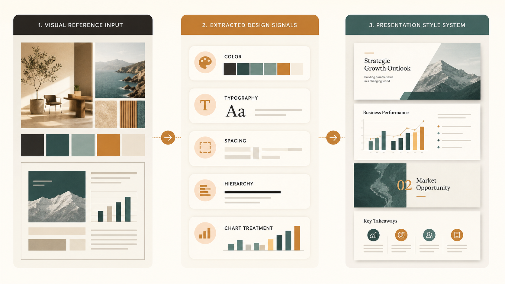
Before writing an AI design prompt, study the reference like a designer would. Start with the color palette. Is it built on dark backgrounds and bright accents, or light backgrounds and soft neutrals? Are colors used for decoration, hierarchy, or data meaning? Then look at typography. Does the reference use large editorial headlines, compact technical labels, or quiet corporate type?
Spacing is equally important. Premium slides often use generous margins and fewer elements, while operational dashboards may use denser layouts. Composition matters too: notice whether the design uses centered symmetry, asymmetrical blocks, modular cards, full-bleed imagery, or strong vertical columns.
For presentation work, pay special attention to hierarchy. Ask what your eye sees first, second, and third. If the visual reference makes the main message obvious, describe how it does that. Finally, identify mood without relying on empty adjectives. Instead of “make it sleek,” write “use a restrained dark background, high-contrast white headlines, thin cyan accent lines, and spacious layouts with one dominant message per slide.”
A Simple Framework for Writing Picture Prompts for Slides
A strong picture prompt for presentations should combine visual style with business context. The formula is simple: reference interpretation, deck purpose, slide type, content hierarchy, and constraints.
For example, a weak prompt might say: “Create slides in the style of this image.” A stronger presentation style prompt would say: “Create an executive strategy deck with a dark navy background, crisp white headlines, subtle cyan accents, generous margins, and modular content blocks. Prioritize one main insight per slide, use minimal decorative elements, and make charts clean, readable, and boardroom-ready.”
For a sales deck, you might write: “Use the reference as inspiration for a premium B2B SaaS look: light background, soft gray sections, bold product screenshots, concise benefit-led headlines, and clear CTA slides. Keep layouts spacious and avoid clutter.”
For a consulting report, try: “Translate the visual reference into an analytical presentation style with structured grids, muted blue and slate colors, compact labels, clear section dividers, and data slides that emphasize the key takeaway above the chart.”
The key is to describe the style as rules, not as a request to imitate the source.
From AI Design Prompt to Presentation Style System
One prompt should not only create one attractive slide. For a full deck, it should establish repeatable rules. This is where many image-to-prompt workflows become more strategic.
A title slide may use the strongest visual expression: large type, bold contrast, and a memorable composition. Section dividers can simplify that style into a consistent transition format. Data slides need stricter rules for readability, chart labeling, and insight hierarchy. Summary slides should feel decisive, with clear takeaways and minimal visual noise.
A presentation style system also helps different slides feel related without becoming repetitive. You might define a rule that every slide has one main headline, one supporting visual zone, and one accent color. Or you might specify that charts use neutral colors by default, with one accent reserved for the key data point. These rules turn visual inspiration into a coherent deck experience.
Where Basic Image-to-Prompt Workflows Break Down
Basic image-to-prompt tools can be useful for describing what is visible. The problem begins when those descriptions are treated as a complete presentation strategy. An AI may overemphasize surface aesthetics and miss the deeper purpose of the slide.
Common issues include overly literal copying, decorative layouts that do not support the message, inconsistent hierarchy from slide to slide, weak text readability, and visuals that feel impressive but irrelevant. A beautiful background, for example, does not help if the audience cannot quickly understand the commercial argument.
Another problem is prompt drift. The first slide may follow the reference closely, while later slides become generic. Professional teams need consistency across a pitch deck, sales deck, executive presentation, or brand proposal. That requires more than visual captioning. It requires a system that connects design direction with structure, storytelling, and business logic.
How Pi Turns Visual Direction into Business-Ready Presentations
Pi, short for Presentation Intelligence, is an AI presentation maker built for professional business presentations. It is not simply an image-to-prompt converter. Pi is designed to help teams turn strong creative direction into decks with structure, hierarchy, and premium visual quality.
1. Business Logic Comes Before Slide Styling
A visual reference can suggest how a deck should feel, but it cannot decide what the deck must prove. Pi helps organize the business argument first: audience, objective, storyline, and slide sequence. This matters for high-stakes use cases such as pitch decks, consulting reports, product launch decks, and executive presentations, where the structure must be as strong as the design.
2. Multi-Agent AI Supports Deeper Presentation Decisions
Pi uses Multi-Agent AI to support different layers of presentation creation. Instead of treating a prompt as a single design instruction, Pi can help coordinate content structure, slide hierarchy, visual direction, and refinement. The result is a workflow that moves beyond “make slides look like this” toward “build a deck that looks premium and communicates clearly.”
3. Premium Aesthetics Stay Connected to the Message
Professional slides need beauty with purpose. Pi helps visual direction serve the content: headlines become sharper, layouts support the key takeaway, and design choices reinforce the intended tone. A visual reference may inspire the palette or spacing, but the final presentation still needs to work as a persuasive business document.
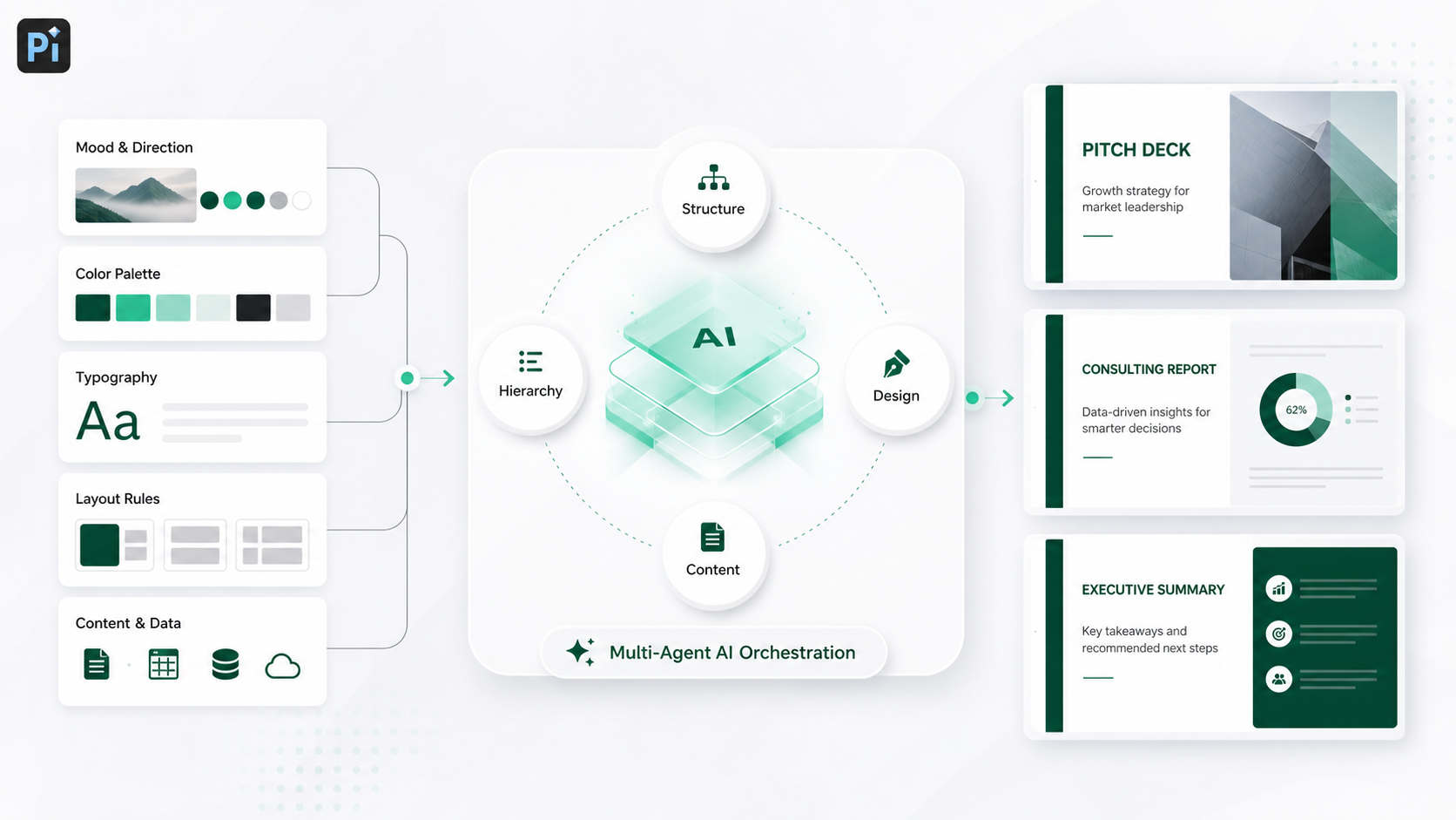
Image-to-Prompt Workflow for Professional Decks
| Workflow Stage | Primary Input | Typical Risk | Professional Output |
| Visual reference | Screenshot, image, moodboard | Style is admired but not defined | Design signals are identified |
| Raw prompt | “Use this image style” | Output becomes literal or generic | Basic visual direction |
| Presentation-ready prompt | Style plus audience, slide type, hierarchy, constraints | Requires clearer thinking | Usable deck design rules |
| Pi-assisted deck creation | Visual direction plus business goal | Must align story and aesthetics | Business-ready presentation system |
This workflow shows why image to prompt is most valuable when it becomes part of a larger presentation process. The reference starts the design conversation, but the final deck must still guide attention, explain ideas, and support a decision.
A Practical Verdict for Teams Using Visual References
Image-to-prompt workflows are useful because they help teams move from vague taste to specific design language. They are especially helpful when you need to create a presentation style prompt, brief a designer, or guide an AI presentation maker toward a clearer visual direction.
The strongest results come from separating surface style from presentation logic. Use the image to define mood, layout, color, typography, and visual rhythm. Then connect those choices to audience needs, content hierarchy, and business outcomes. For professional teams, that connection is what turns inspiration into a credible pitch deck, sales deck, consulting report, executive presentation, or brand proposal.
Pi is built for that deeper workflow: visual direction becomes part of a structured, business-ready presentation process rather than a one-off design instruction.
Frequently Asked Questions (FAQ)
Q: What does image to prompt mean for presentations? A: Image to prompt means translating a visual reference into written instructions that guide presentation design. For slides, this usually includes color, typography, layout, spacing, hierarchy, mood, and constraints.
Q: How do I write a good presentation style prompt? A: Describe the visual style, the deck purpose, the audience, the slide type, the desired hierarchy, and any constraints. Avoid vague words alone. Instead of “modern,” specify the palette, spacing, typography mood, chart treatment, and level of visual density.
Q: Can AI copy the style of an image exactly? A: AI can interpret broad design signals from an image, but it should not be used to copy protected designs, proprietary brand systems, logos, or distinctive visual identities. A better approach is to extract general principles and adapt them into an original presentation style.
Q: How does Pi help with professional presentation creation? A: Pi helps teams combine visual direction with business logic, structured storytelling, slide hierarchy, and premium aesthetics. It is designed for professional decks such as pitch decks, sales decks, consulting reports, executive presentations, and brand proposals.