Where to Find Free Icons for Presentations
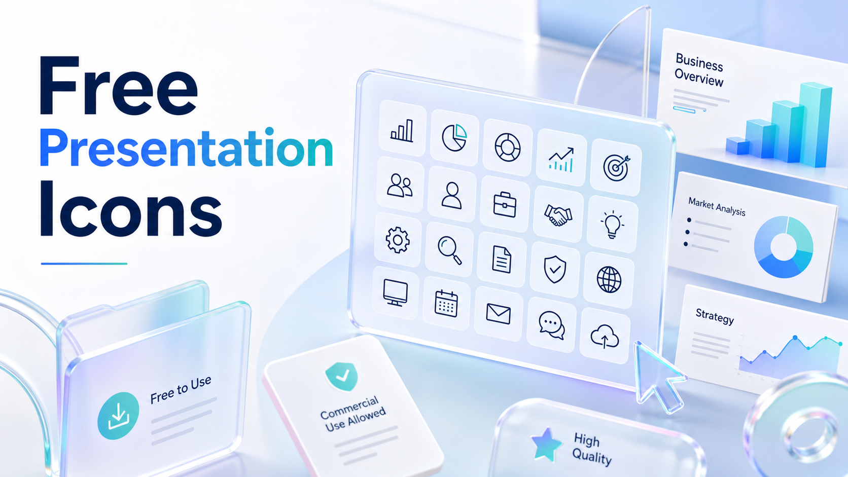
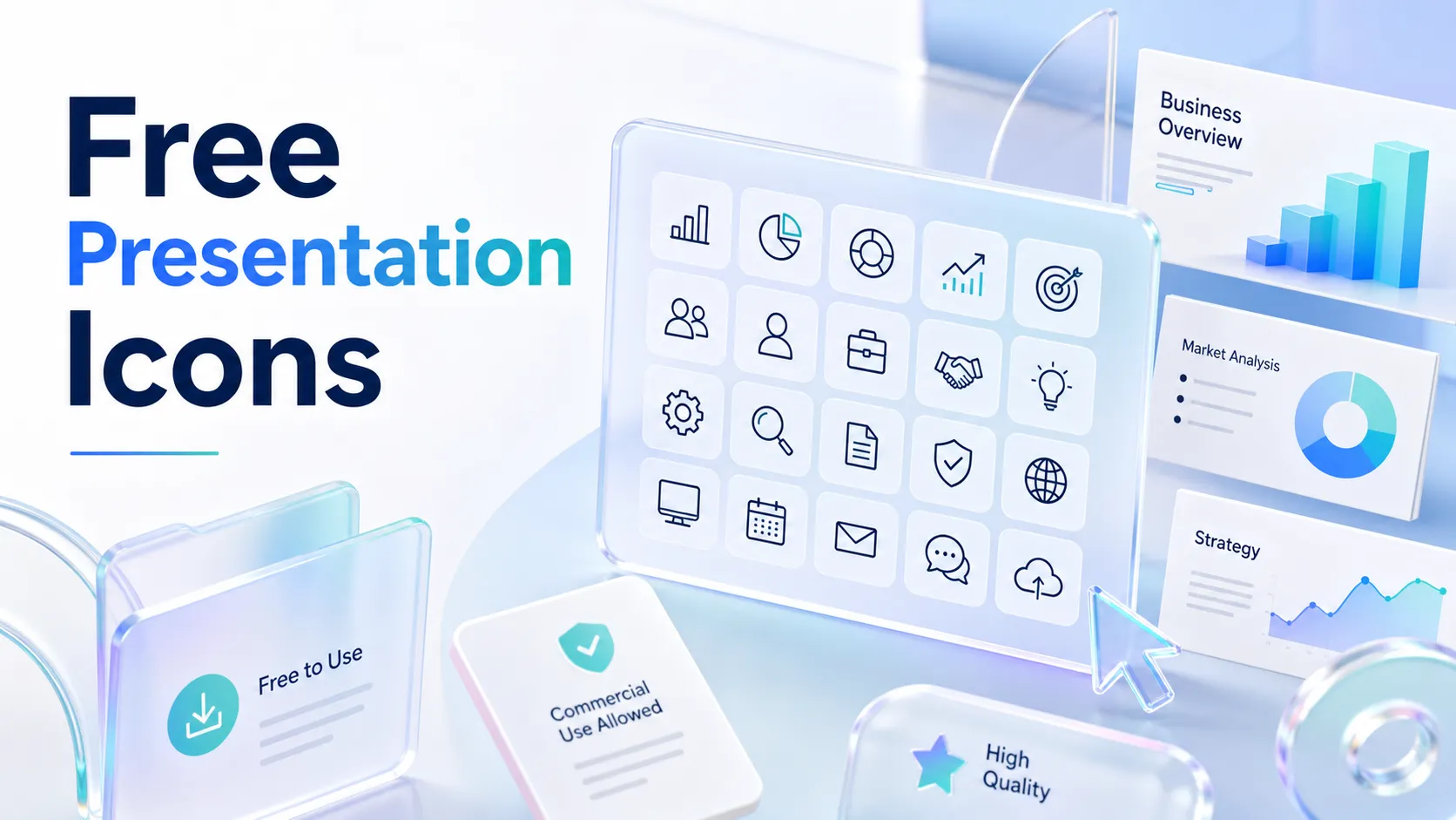
Free icons can make a presentation easier to scan, cleaner to read, and more visually organized. They help show categories, process steps, product features, risks, benefits, or business functions without adding more text to the slide.
However, finding free presentation icons is only the first step. The bigger challenge is choosing icons that fit the message, match the tone of the deck, and stay consistent across slides. Icons should support audience understanding, not simply decorate empty space.
This guide explains where to find reliable presentation icons, what to check before using them, and how to apply them professionally in PowerPoint, Google Slides, and business presentation workflows.
Why Icons Matter in Presentation Design
Icons turn abstract ideas into quick visual signals. A gear can suggest operations, a shield can suggest security, and a chart can suggest analytics. Used well, icons reduce cognitive load because the audience can recognize a concept before reading every word.
In presentation design, icons are most useful when they help viewers answer practical questions: What category is this? Which point matters most? How are these ideas connected? Where should attention go next?
The risk is that icons can also become visual noise. If every bullet has an icon, or if icons are added only to make a slide feel less empty, they may distract from the message. Professional decks use icons with restraint. They make slides clearer, not busier.
What to Check Before Using Free Presentation Icons
Before downloading or inserting free icons into a deck, review a few practical criteria. Not every “free” icon is suitable for commercial, client-facing, or executive use.
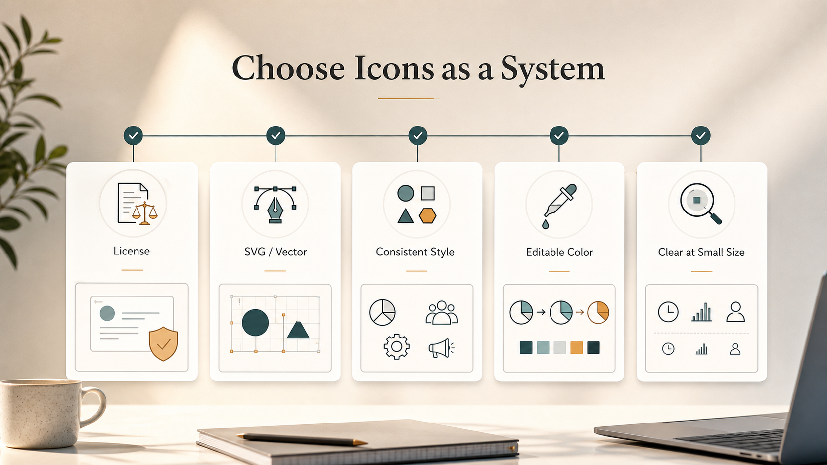
Check these points before using an icon resource:
- License terms for personal, commercial, or attribution-based use
- File format, especially whether SVG is available for resizing and recoloring
- Visual style, including line weight, corner radius, and level of detail
- Editability for brand colors and presentation themes
- Clarity at small sizes on a slide
- Suitability for business, executive, or B2B contexts
These checks are especially important for PowerPoint icons used in sales decks, consulting reports, pitch decks, and client proposals. A small inconsistency can make a deck feel less polished, even when the content is strong.
Reliable Places to Find Free Presentation Icons
The easiest place to start is often inside the presentation software itself. PowerPoint includes built-in icons that can be inserted, resized, and recolored directly. They are practical for everyday business slides because they are accessible, editable, and generally consistent.
Open icon libraries are another useful source. They often provide simple SVG icons across business, technology, finance, education, health, and productivity categories. These libraries help when you need more options than PowerPoint or Google Slides provides.
SVG icon sets are especially valuable for professional presentation design. Because SVG files are vector-based, they stay sharp at any size and can often be edited to match your deck’s visual system. This makes them helpful for diagrams, process flows, product feature slides, and dashboards.
Design platforms also offer searchable icon collections. Their main advantage is speed: icons are categorized and easy to place into layouts. The limitation is that some icons may feel generic, and exports may not always remain editable depending on the platform and file type.
The best approach is not to collect icons from too many places. Choose one or two reliable icon resources and use them consistently across the deck.
How to Choose the Right Icon Style
Different icon styles create different impressions. Minimalist line icons work well in executive presentations, strategy decks, and consulting-style reports because they feel restrained and analytical. They support the message without competing with charts, numbers, or slide headlines.
Filled icons are useful when the deck needs stronger visual contrast. They can work well for internal training, onboarding decks, simple explainers, and educational presentations. Because they carry more visual weight, they should be used carefully in dense business slides.
Duotone or custom-colored icons can help branded decks feel more distinctive. They are useful in sales presentations, brand proposals, product launch decks, and investor materials when the visual identity needs to feel intentional. However, color should support hierarchy. If every icon uses a different bright color, the slide can feel fragmented.
The right style depends on the audience and purpose. A board update usually needs quiet precision. A marketing launch deck may allow more energy. A technical product presentation may need icons that are literal and easy to decode.
Common Icon Mistakes That Weaken Slides
The most common mistake is mixing icon families. A thin line icon next to a heavy filled icon can make a slide feel assembled from unrelated sources. Even if each icon looks good alone, the group may not look professional together.
Another mistake is using icons that are too detailed. Presentations are viewed quickly, often from a distance or on shared screens. If an icon contains too many small shapes, it may become unclear at slide size.
Stretching icons is also a problem. Icons should be resized proportionally. Distorted icons signal careless formatting and can reduce confidence in the overall deck.
A subtler mistake is choosing icons without meaning. Decorative icons may fill empty space, but they do not improve comprehension. If an icon does not clarify the point, guide the viewer, or reinforce the structure, it may not belong on the slide.
Most importantly, icons cannot fix weak slide logic. If the narrative is unclear, adding more visuals will not solve it. Icons support communication; they do not replace a strong argument.
From Icon Resources to Business-Ready Presentation Design
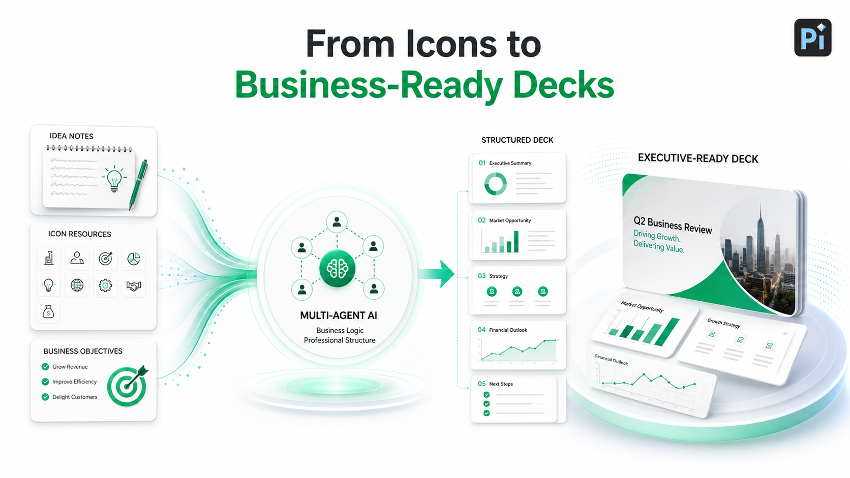
Free icons can improve individual slides, but professional presentations require more than attractive assets. A business-ready deck needs a clear storyline, consistent visual hierarchy, credible content, and a structure that helps the audience make decisions.
This is where Pi, short for Presentation Intelligence, fits into the workflow. Pi is an AI presentation maker and AI PPT generator designed for professional business presentations. It helps teams move from raw ideas to structured, polished decks with stronger business logic and premium visual consistency.
1. Business Logic Comes Before Slide Styling
A deck should begin with the argument, not the decoration. Pi’s Multi-Agent AI helps shape the presentation around the business objective: what the audience needs to understand, what decision is being supported, and how the story should unfold.
This matters because icons are only effective when the slide has a clear purpose. A sales deck may use icons to distinguish pain points, capabilities, and proof points. A consulting report may use them to separate workstreams, risks, and next steps. In both cases, icon choice depends on the story structure.
2. Visual Consistency Becomes Easier to Maintain
When a presentation has a strong structure, design decisions become more consistent. Teams can decide where icons should appear, which slide types need them, and which sections should rely more on charts, text, or diagrams.
Pi supports this workflow by helping teams create professional structure for pitch decks, sales decks, consulting reports, executive presentations, brand proposals, market research decks, and product launch decks. Icons then become part of a broader communication system rather than isolated design elements.
3. Premium Design Depends on More Than Assets
Business-grade aesthetics are not about using more design assets. They depend on alignment, spacing, typography, color, and visual hierarchy. Free icons remain useful in this process, but they should serve the larger design system. A deck feels polished when every visual choice appears intentional.
A Practical Decision Table for Choosing Icon Resources
| Presentation Need | Best Icon Resource Type | What to Watch For |
| Quick internal PowerPoint deck | Built-in PowerPoint icons | Limited style variety |
| Executive or consulting deck | Minimal SVG icon set | Consistent line weight |
| Branded sales presentation | Editable vector icons | Brand color alignment |
| Training or educational slides | Simple filled icon collection | Avoid visual clutter |
| Product or technical deck | Open icon library | Clear category coverage |
Final Recommendation: Use Icons as a System, Not Decoration
Free icons are valuable when they make a presentation clearer, more consistent, and easier to scan. The best free presentation icons are not necessarily the most detailed or stylish. They are the icons that match the tone of the deck, support the message, and work as part of a coherent visual system.
For simple slides, built-in PowerPoint icons may be enough. For more polished business decks, SVG icon sets and carefully selected open libraries offer more flexibility. For high-stakes presentations, icons should be considered alongside the full structure of the deck: storyline, hierarchy, evidence, and visual consistency.
Use icons to guide attention, not to fill space. Choose one style, apply it consistently, and make sure every icon earns its place on the slide.
Frequently Asked Questions (FAQ)
Q: Where can I find free presentation icons?
A: You can find free presentation icons in built-in PowerPoint icons, open icon libraries, SVG icon sets, and design-platform icon collections. The best choice depends on your presentation type, license needs, and visual style.
Q: Are PowerPoint icons free to use?
A: PowerPoint icons are generally available within PowerPoint for users of supported Microsoft plans, but usage rights can depend on your account, license, and context. Review the relevant terms before using them in commercial or client-facing work.
Q: Can I use free icons in business presentations?
A: Sometimes. Some free icons allow commercial use, while others require attribution or are limited to personal projects. Always check the license before using free icons in sales decks, pitch decks, consulting reports, or client proposals.
Q: How many icons should I use in a professional deck?
A: Use only as many as needed to improve clarity. Icons can help with section markers, process steps, feature categories, or summary points, but not every slide needs them. Consistency and purpose matter more than quantity.