Presentation Fonts That Improve Readability
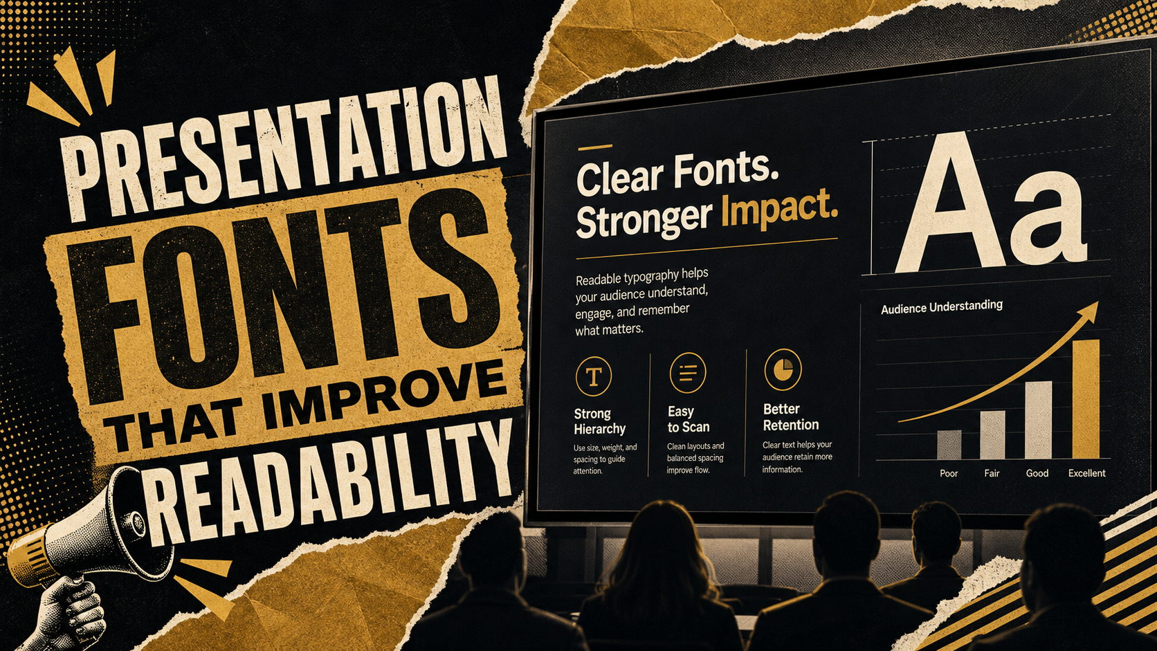
Font choice can make a presentation feel clear, credible, and easy to follow—or crowded, distracting, and harder to trust. The bestpresentation fonts are not simply the ones that look modern in a design preview. They are the fonts that remain readable in real conditions: conference rooms, screen sharing, projectors, compressed PDFs, and fast executive review.
Readable typography helps the audience understand the message while listening to the speaker. In business and educational settings, slides are rarely read slowly. They are scanned from a distance, reviewed quickly, or opened on different devices. Strong business fontsreduce friction so the audience can focus on the idea, not the text.
Why Presentation Fonts Matter
Fonts influence more than style. They affect pacing, comprehension, visual hierarchy, and perceived professionalism. A clean font system helps people know where to look first, which statement is the headline, and which details support the main point.
The wrong font creates subtle problems. Thin type can disappear on a projector. Decorative type can slow reading. Narrow letterforms can make dense charts feel crowded. Inconsistent fonts can make a deck feel assembled rather than designed.
This matters most in executive presentations, sales decks, consulting reports, classroom lectures, pitch decks, and financial updates. In these settings, typography should support the message, not compete with it.
What Makes a Font Readable on Slides
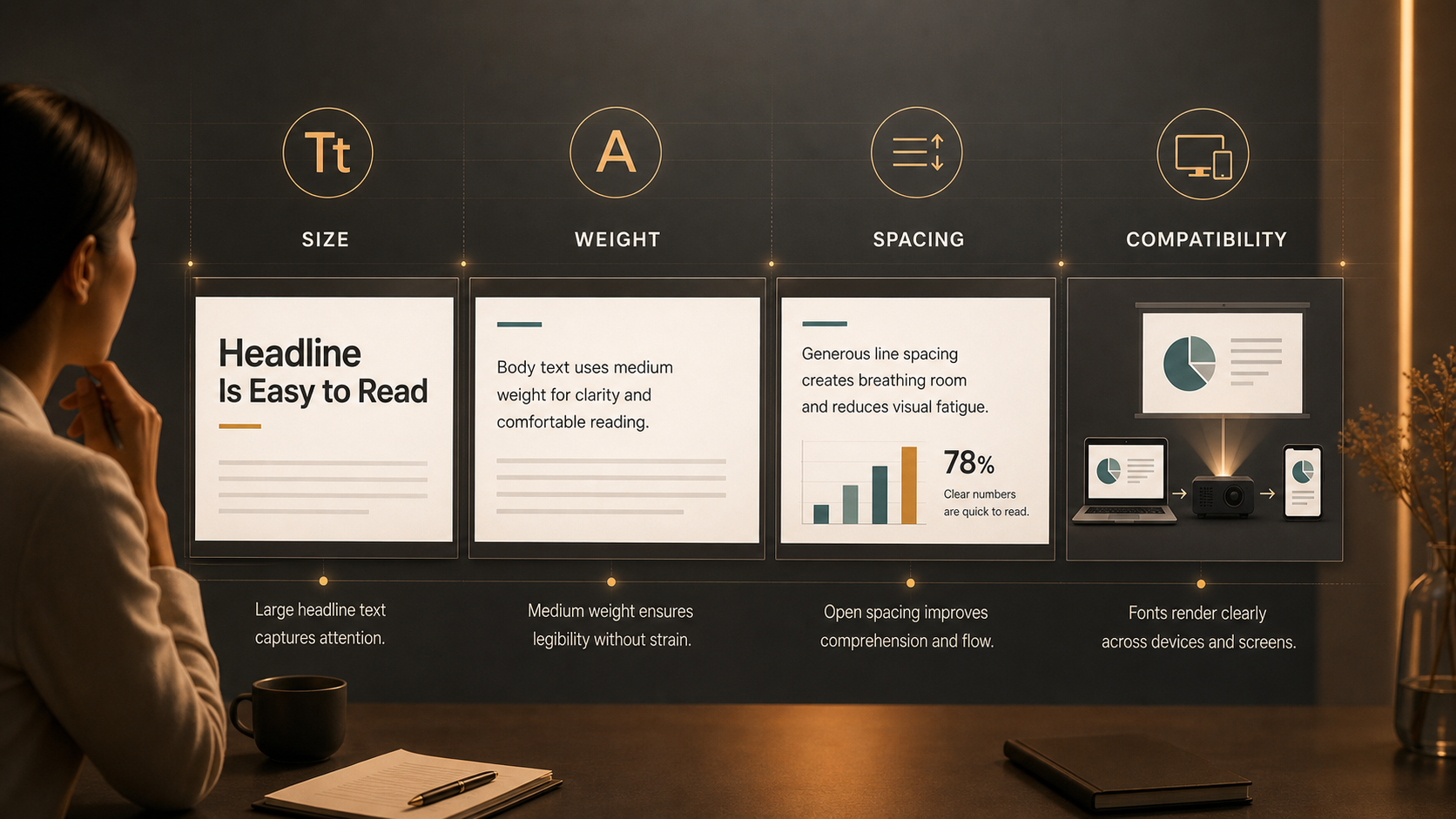
Readable fonts usually have clear letter shapes, enough weight to hold up on screens, balanced spacing, and strong scalability from large titles to smaller labels. A font that looks elegant at 72 points may fail at 14 points inside a chart.
When choosing readable fonts, test them against practical questions:
- Can people distinguish similar characters, such as I, l, and 1?
- Does the font remain clear when projected or screen-shared?
- Are numbers easy to read in charts, tables, and financial slides?
- Does the typeface include enough weights for hierarchy?
- Will the font render correctly when the deck is shared?
The goal is not to choose the most beautiful typeface in isolation. The goal is to choose a font that makes the full deck easier to understand.
Common Presentation Fonts for Professional Slides
Many widely used presentation fonts work well because they are familiar, clean, and screen-friendly. Arial is a safe, highly compatible option for simple business decks. Calibri remains readable and familiar, though it can feel less distinctive in newer presentations. Aptos, Microsoft’s newer default, offers a more contemporary look while preserving strong readability.
Helvetica is popular for premium, minimalist decks, especially where brand guidelines support it. Inter is a modern UI-inspired typeface that performs well on digital screens and suits product, SaaS, and technology presentations. Source Sans 3 is another clean sans-serif option with flexible weights and a professional tone.
Verdana is useful for smaller text because of its generous spacing. Segoe UI fits naturally into Microsoft-oriented environments. Georgia, a serif font, can work for titles, quotes, or editorial-style slides, but it should be used carefully for dense body text.
No single font is best for every presentation. The strongest choice depends on audience, brand, content density, and delivery format.
Business Fonts vs. Decorative Fonts
Business fonts are designed to stay out of the way. They make slide content look structured, consistent, and credible. Decorative fonts communicate personality, but they are usually risky for core business content.
A sales forecast, market analysis, investor update, or consulting recommendation should not depend on a font that is difficult to scan. Expressive typefaces can add character to event titles or section dividers, but they often reduce comprehension when used in body copy, chart labels, or tables.
A practical approach is to use a readable business font for most of the deck, then apply expressive typography only where the message genuinely benefits from it.
PowerPoint Fonts and Compatibility
Choosing PowerPoint fonts is also a compatibility decision. A font may look perfect on your computer and change unexpectedly when opened on another device. That can affect line breaks, chart labels, slide layouts, and overall polish.
For team workflows, consider whether the font is available across PowerPoint, Google Slides, PDFs, and the operating systems used by stakeholders. Standard fonts such as Arial, Calibri, Aptos, Verdana, Georgia, and Segoe UI are often safer for handoffs. Custom brand fonts can work well, but they should be embedded where possible or exported carefully as PDFs for final delivery.
Compatibility matters most when a deck will be edited by several people. If a missing font causes text to reflow, a carefully designed slide can become misaligned. For high-stakes presentations, test the deck on the device or platform that will be used in the actual meeting.
Size, Weight, and Spacing Matter Too
Font choice is only part of readability. Size, weight, and spacing often matter just as much. A strong font can still fail if it is too small, too light, or packed too tightly.
Headlines should be large enough to read quickly. Body text should usually be much larger than document text, especially in live presentations. Chart labels and footnotes should be used sparingly; if they become too small to read, the slide may need simplification.
Avoid very thin weights for body text and labels. They can look refined on a high-resolution screen but disappear in projection or video calls. Regular or medium weights are usually safer. Line spacing should give text enough breathing room, especially when slides include bullets or explanatory sentences.
If you are unsure whether text is large enough, view the slide in slideshow mode or step back from the screen. Readability should be tested, not assumed.
How Font Pairing Improves Hierarchy
Font pairing helps create hierarchy, but it should not make the deck feel complicated. Many professional presentations work best with one font family used in different weights. A bold weight can define headlines, a regular weight can support body text, and a medium weight can highlight labels or key figures.
When using two fonts, assign each one a clear role. A serif font might be used for section titles, while a sans-serif font handles body copy and charts. A modern sans-serif might support product screenshots, while a neutral font handles executive summaries.
Good hierarchy lets the audience understand the slide before reading every word. The headline explains the takeaway, the body text adds context, and labels clarify evidence. Typography should guide that order naturally.
Where Pi Fits in a Professional Presentation Workflow
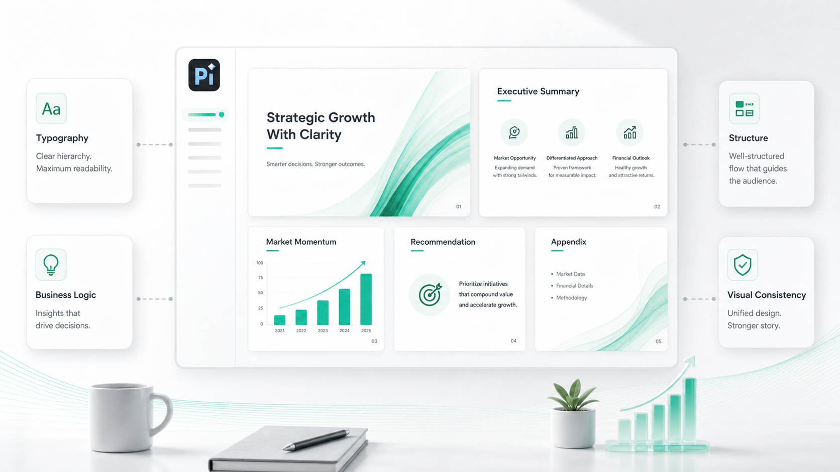
Professional teams often need more than a list of fonts. They need a workflow that applies typography consistently across structure, messaging, visual hierarchy, and business logic. Pi, short for Presentation Intelligence, is an AI presentation maker and AI PPT generator built for professional business presentations where design decisions support the argument.
Pi helps teams shape presentations around the message first. That matters because typography is most effective when the slide has a clear purpose. A readable font cannot rescue a slide with unclear logic, overloaded content, or no hierarchy.
In a business-ready deck, fonts should work across title slides, executive summaries, charts, tables, section dividers, recommendations, and appendix pages. Pi supports workflows where visual quality and professional structure are considered together, instead of treating font selection as a final cosmetic step.
High-stakes decks often pass through multiple reviewers. Inconsistent formatting can make a presentation feel less polished, even when the content is strong. Pi helps teams move toward a more consistent presentation system, where typography, layout, and messaging align across the deck.
| Presentation Need | Standard Slide Tools | Pi |
| Font selection | Manual choice and formatting | Applied within a structured workflow |
| Slide hierarchy | Built slide by slide | Guided by business logic |
| Visual consistency | Depends on editor discipline | Supports deck-wide polish |
| Professional use cases | Flexible general creation | Business-ready presentation workflows |
A Simple Font Selection Checklist
Choose fonts based on audience, setting, content type, and sharing workflow. A board presentation may need conservative, highly readable typography. A product launch deck may allow a more modern visual tone. A classroom presentation may need larger type and generous spacing for visibility.
Before finalizing a deck, ask whether the font matches the brand, reads well at different sizes, supports numbers and charts, and will remain stable across platforms. Review the presentation in slideshow mode, not only in the editing canvas. If the deck will be shared, test it as a PowerPoint file and as a PDF.
The Verdict
The best PowerPoint fonts and business fonts are the ones that help the audience read with less effort. Style matters, but readability carries the message. For simple decks, a clean standard font and consistent formatting may be enough. For professional teams creating high-stakes presentations, typography should be part of a larger system of structure, hierarchy, and business logic. That is where Pi can help turn font choice into one element of a clearer, more polished presentation workflow.
Frequently Asked Questions (FAQ)
Q: What are the best presentation fonts for business slides?
A: Arial, Aptos, Helvetica, Inter, Source Sans 3, Verdana, Segoe UI, and Calibri are common readable options. The right choice depends on brand fit, screen size, content density, and compatibility.
Q: What PowerPoint fonts are safest for sharing?
A: Fonts commonly available across systems are usually safest. Arial, Calibri, Aptos, Verdana, Georgia, and Segoe UI are practical choices. If you use a custom font, test it on another device or export the final deck as a PDF.
Q: Are serif fonts readable in presentations?
A: Serif fonts can work well for titles, quotes, or editorial-style slides. For dense body text, chart labels, and small annotations, sans-serif fonts are often safer on screens and projectors.
Q: How many fonts should a presentation use?
A: Most professional presentations should use one font family with multiple weights or two complementary fonts at most. Too many fonts weaken consistency and make the deck harder to scan.