Presentation Redesign Case Study: Before vs After Slide Makeover
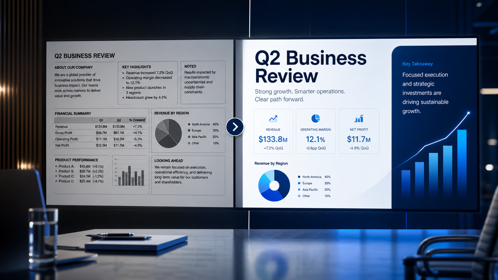
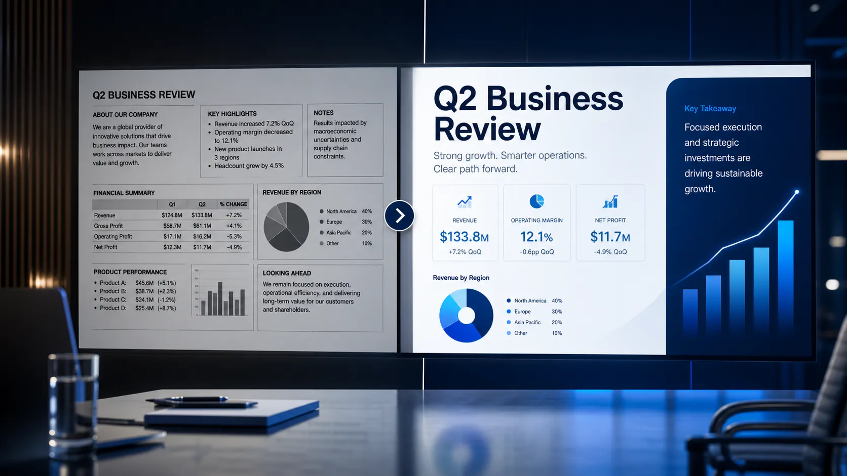
A strong presentation redesign does more than make slides look cleaner. It makes the argument easier to follow, the evidence easier to trust, and the next step easier to approve. In this presentation case study, we compare a realistic original deck with its redesigned version to show what changes in a practical slide makeover.
The example is a fictional B2B sales proposal for a software company selling an operational efficiency platform to an enterprise buyer. The original deck had useful content, but the message was buried under dense text, inconsistent formatting, weak headlines, and charts that required too much interpretation. The redesigned version used clearer hierarchy, stronger slide purpose, better spacing, and consistent visuals to make the same content more persuasive.
Why Presentation Redesign Is More Than Visual Polish
Many teams treat redesign as a surface task: improve colors, align boxes, add icons, and make the deck look modern. Those changes help, but they do not solve the deeper issue if the audience still has to work too hard.
A true presentation redesign clarifies what each slide is trying to prove, what the audience should notice first, and how the story moves from problem to recommendation. In the original deck, the main issues were clear:
- Slide titles described topics instead of stating insights.
- Text blocks competed with charts and callouts.
- Formatting changed from slide to slide.
- Data appeared without a clear takeaway.
- The final slide ended with “Thank you” instead of a decision path.
The redesign did not invent a new business case. It made the existing business case visible.
The Original Presentation: What Was Holding It Back
The original presentation was a 14-slide sales proposal built from internal notes, product messaging, and customer research. It included the right ingredients: market problem, buyer pain points, platform capabilities, ROI assumptions, and a pilot plan. But it felt more like a document copied into slides than a presentation designed for a meeting.
The sequence was the first problem. The deck opened with company background, moved into product features, and only later explained the buyer’s operational pain. That made the audience wait too long before understanding why the solution mattered.
The second problem was hierarchy. Most slides had a long title, subtitle, several bullets, and a visual element. Because everything looked important, nothing felt important.
The third problem was consistency. Backgrounds, chart labels, icon styles, and margins shifted across the deck. No single mistake ruined the presentation, but together they made it feel unfinished.
The Redesigned Presentation: What Changed
The redesigned deck kept the same core content but rebuilt the structure around the buyer’s decision journey. Instead of starting with “Who we are,” it opened with the operational cost of fragmented workflows. The company introduction moved later, after the audience understood the problem.
Slide titles were rewritten as messages, not labels. “Market Challenges” became “Operations teams lose visibility when work is spread across disconnected tools.” “Platform Features” became “A unified workflow layer reduces manual handoffs and approval delays.” This shift made the deck easier to scan before the presenter spoke.
The visual system also became more disciplined. The redesigned version used one typography hierarchy, consistent spacing, fewer colors, and repeated layout patterns for similar slide types. Charts were simplified so the most important trend could be understood in seconds.
Before vs After Slide Makeover: Key Changes
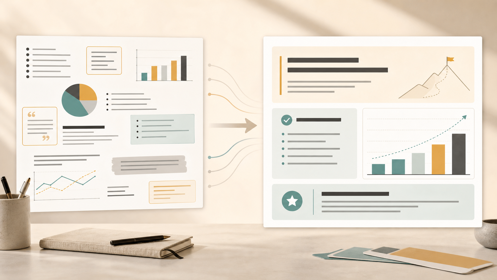
1. Title Slide: From Generic Opening to Clear Positioning
Before the redesign, the title slide showed the company logo, product name, and “Enterprise Workflow Automation Proposal.” It was accurate, but it did not define the value of the meeting.
After the redesign, the title became “Reducing Approval Delays Across Enterprise Operations.” A short subtitle clarified the objective: “A pilot proposal for improving workflow visibility, handoff speed, and management control.” The redesigned title positioned the discussion around a business outcome, not a product category.
2. Problem Slide: From Text Dump to Focused Tension
The original problem slide listed seven bullet points about inefficiency, tool fragmentation, manual reporting, approval delays, and limited visibility. Each point was valid, but the slide had no center of gravity.
The redesigned slide focused on one tension: “Work is moving faster than management visibility.” Instead of seven bullets, it used three evidence blocks: delayed approvals, manual status updates, and unclear process ownership. Each block had a short label, one sentence, and a supporting metric. The audience could understand the problem in one scan.
3. Data Slide: From Crowded Chart to Visible Insight
The original data slide included a clustered bar chart, six categories, small labels, and several commentary boxes. The main insight was that approval cycle time increased when requests crossed more than two teams, but that message was hidden.
The redesigned slide used the title “Cross-team approvals create the largest delay risk.” The chart was simplified to show only the relevant comparison. The highest-delay category was highlighted, secondary data was muted, and a short annotation pointed to the key increase. The slide no longer asked executives to decode the data; it guided them to the decision-relevant insight.
4. Solution Slide: From Feature List to Business Value
Before the redesign, the solution slide listed capabilities: workflow builder, approval routing, dashboards, alerts, integrations, and reporting. This showed product breadth, but it did not explain why the capabilities mattered.
The redesigned slide grouped features into business outcomes. “Workflow builder” and “approval routing” became “Standardize how work moves.” “Dashboards” and “alerts” became “See delays before they escalate.” “Integrations” and “reporting” became “Connect existing tools without adding manual updates.” The slide made value explicit.
5. Closing Slide: From Weak Ending to Clear Next Step
The original closing slide said “Thank You” with contact information. It was polite, but it did not help the audience decide.
The redesigned closing slide recommended a specific action: “Approve a 6-week pilot across two workflow teams.” It included pilot scope, success metrics, and the immediate next step. The final slide became a decision slide, not a farewell slide.
Presentation Redesign Comparison Table
| Redesign Area | Original Presentation | Redesigned Presentation |
| Message clarity | Topic-based slide titles | Insight-driven headlines |
| Information hierarchy | Dense text with equal weight | Clear primary message and support |
| Layout control | Inconsistent spacing and alignment | Repeated structure by slide type |
| Visual consistency | Mixed styles, colors, and icons | Unified typography and visual system |
| Data readability | Crowded charts with weak emphasis | Simplified charts with highlighted takeaways |
| Audience impact | Requires interpretation | Guides attention toward decisions |
How Pi Helps Turn Rough Slides Into Business-Ready Presentations
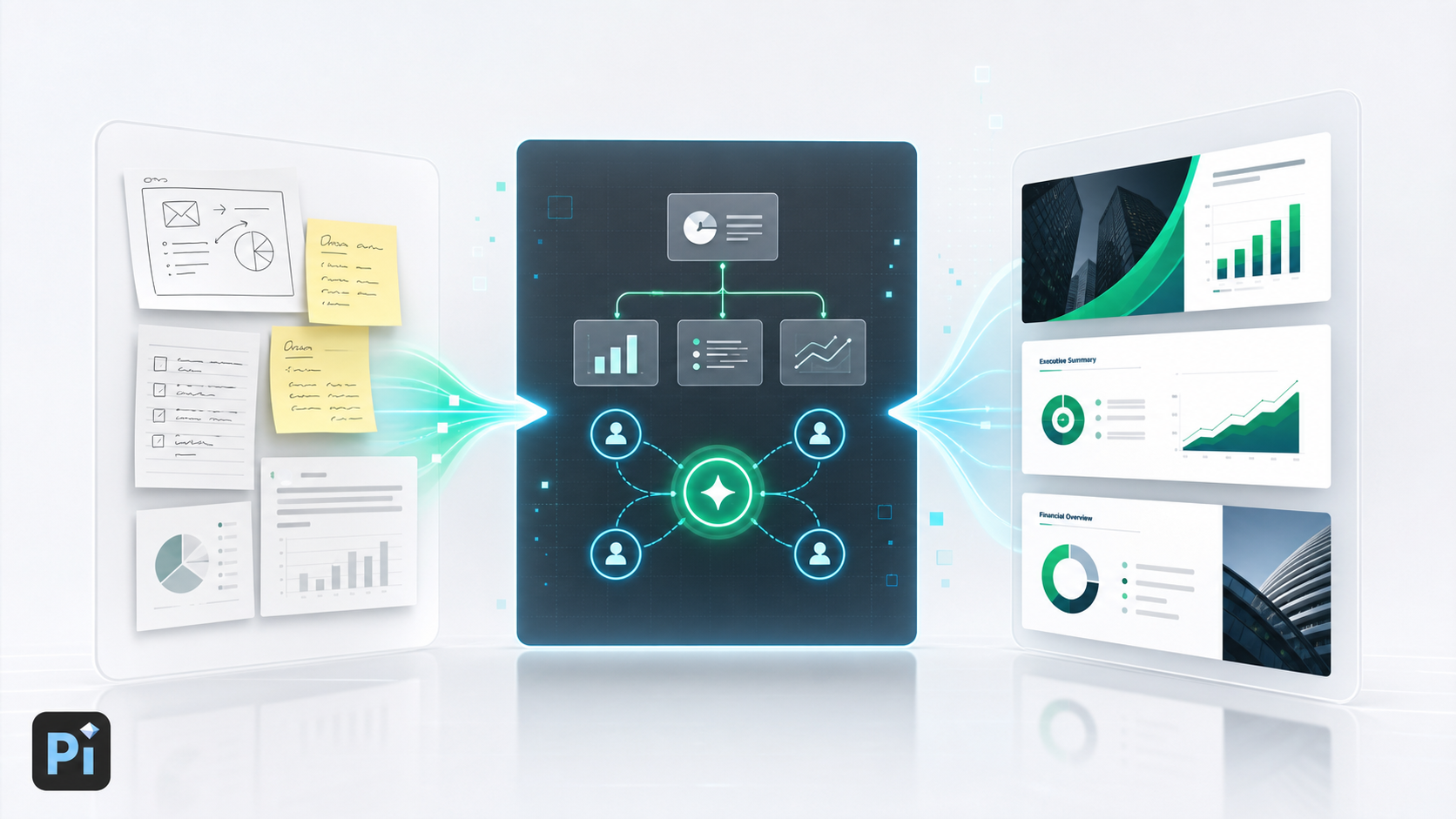
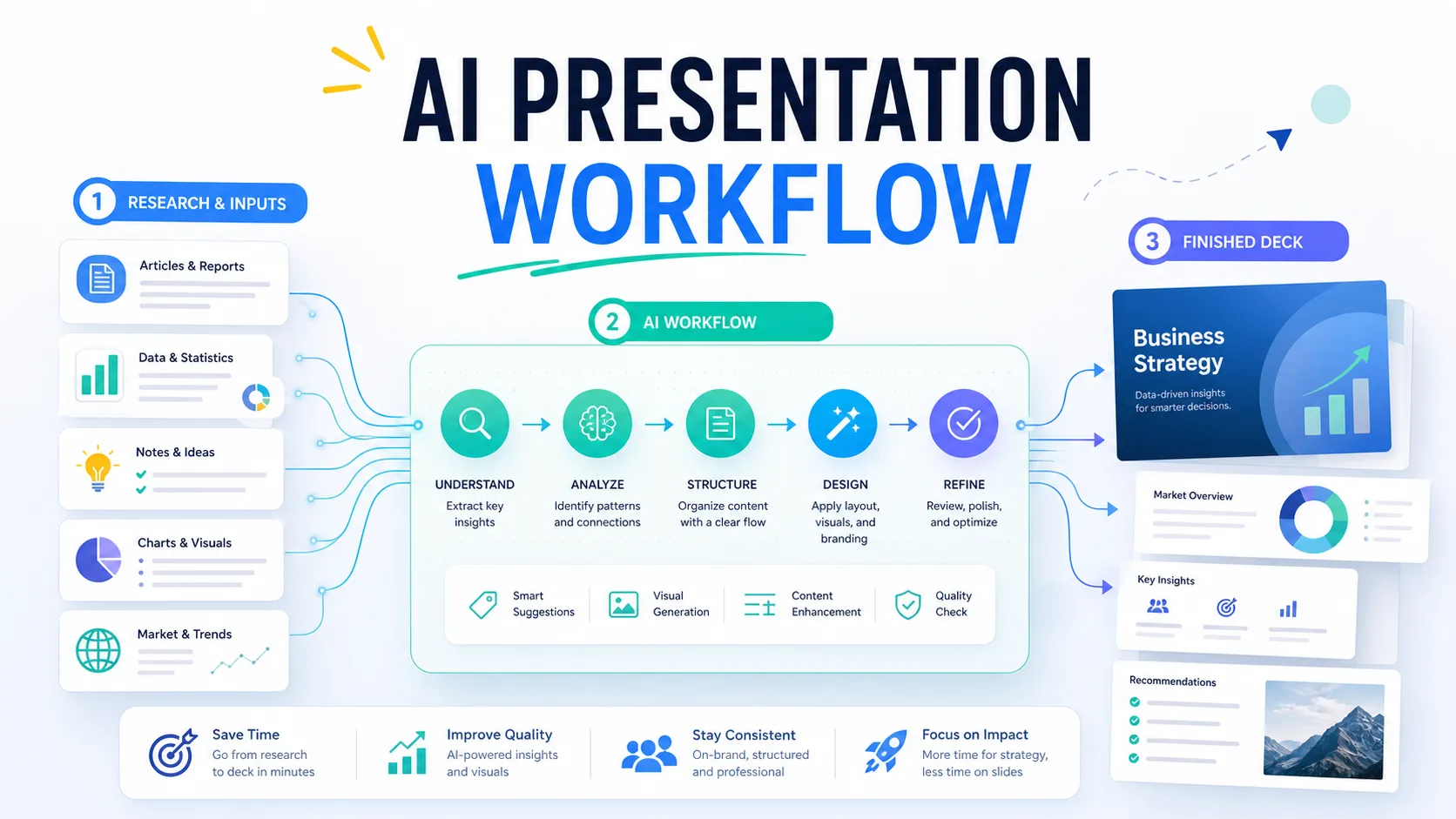
Once you compare the before and after version, the redesign challenge becomes clear: teams need more than prettier slides. They need a workflow that improves business logic, slide structure, and visual execution together. Pi, short for Presentation Intelligence, is an AI presentation maker built for professional business presentations.
In this case study, the biggest improvement came from reframing the argument. The redesigned deck moved from company-first messaging to audience-first messaging. Pi supports this deeper workflow by helping organize a presentation around objective, audience, and business outcome before focusing on design.
This matters for pitch decks, sales decks, consulting reports, executive presentations, brand proposals, market research decks, and product launch decks. A polished slide with weak logic still feels unconvincing. Pi’s Multi-Agent AI approach is designed to help shape the story, structure the reasoning, and connect slides into a coherent business narrative.
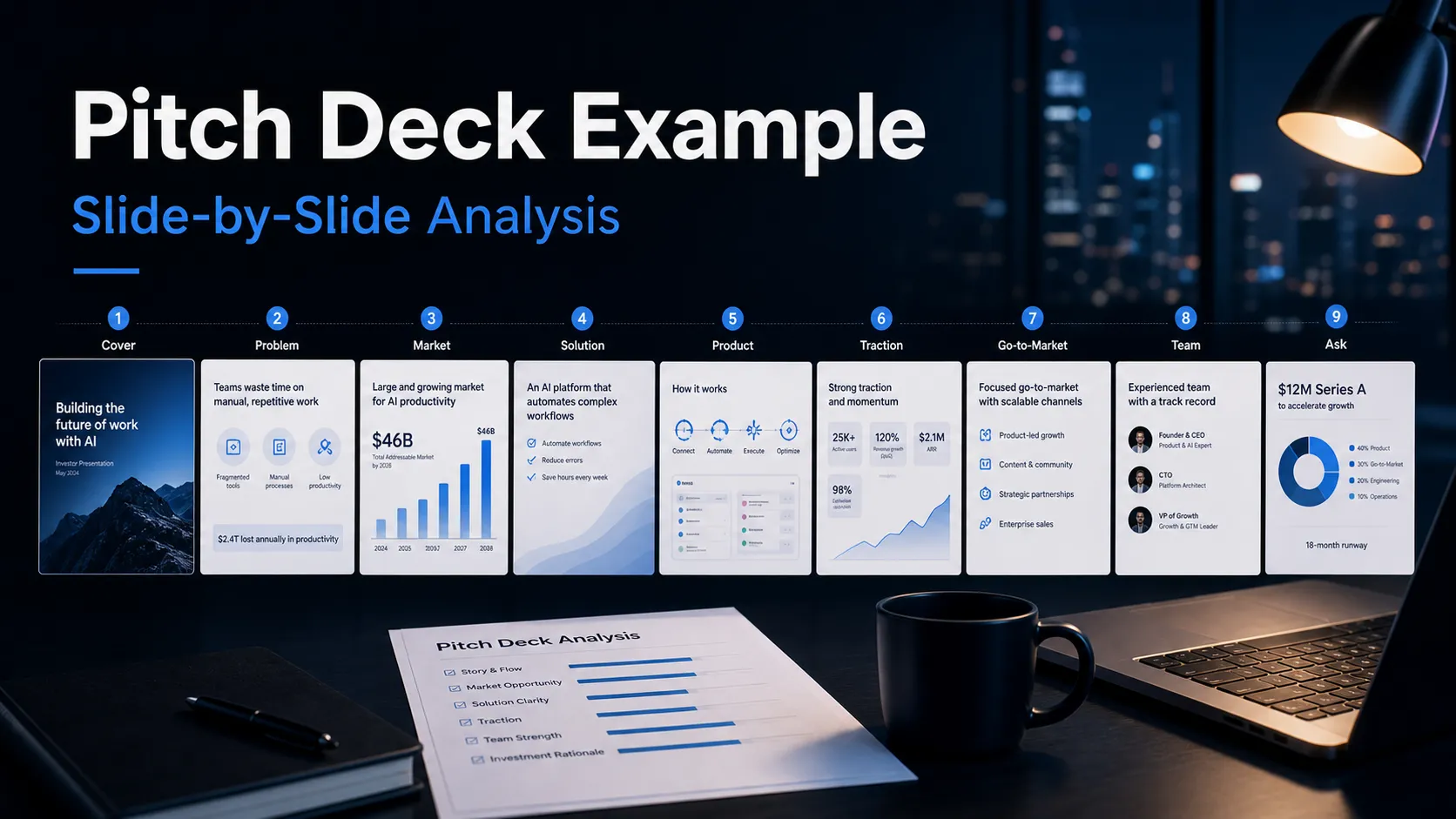
A messy draft often contains useful material in the wrong order. Teams may have strong data, customer insights, and product value, but the deck does not guide the audience through them effectively. Pi can help turn rough notes or overloaded slides into a more structured presentation flow by clarifying slide purpose, separating problem from evidence, and creating a stronger path from context to recommendation.
The after version also looked more professional because the visuals supported the message. Typography, spacing, chart treatment, and color were not decoration; they helped the audience process information faster. For professional teams, the goal is not to create a flashy deck. The goal is to create slides that feel consistent, controlled, and ready for important conversations with executives, buyers, investors, or clients.
The Verdict: What This Presentation Redesign Case Study Teaches
This before and after presentation shows that the best slide makeover work begins with communication discipline. The redesigned deck did not succeed because it used a better color palette. It succeeded because each slide had a clearer job.
The title slide positioned the business issue. The problem slide focused tension. The data slide highlighted the insight. The solution slide translated features into value. The closing slide turned the discussion into a next step.
That is the core lesson of this presentation redesign case study: better slides reduce the audience’s effort. When hierarchy, layout, and business logic work together, the presentation becomes easier to understand and easier to act on.
Frequently Asked Questions (FAQ)
Q: What is included in a presentation redesign?
A: A presentation redesign usually includes improving story flow, rewriting slide headlines, reducing text, clarifying hierarchy, simplifying charts, improving layouts, and creating a consistent visual system.
Q: How is a slide makeover different from basic formatting?
A: Basic formatting fixes surface issues such as alignment, fonts, and colors. A slide makeover also asks what the slide should communicate and whether the layout supports the business message.
Q: What makes a good before and after presentation example?
A: A good example shows specific changes: clearer headlines, fewer competing elements, stronger chart emphasis, better spacing, and a more actionable ending.
Q: Can AI help with presentation redesign?
A: Yes. AI can help restructure rough content, improve slide logic, rewrite titles, and generate more polished layouts. For business presentations, Pi is useful when teams need both professional structure and premium visual quality.