Executive Summary Slide Example: What Makes It Effective?
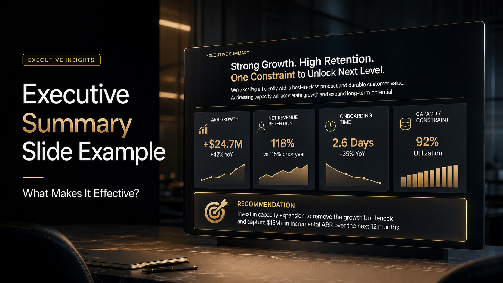
An effective executive summary slide example should not feel like a compressed version of an entire deck. It should feel like a decision-ready snapshot: the main message, the evidence behind it, the business implication, and the recommended next step.
That is why executive summary slides are difficult to build. They must be brief without becoming vague, data-driven without overwhelming the reader, and polished without letting design distract from the business logic.
This article analyzes a realistic executive summary slide and explains what makes it work. The focus is not only slide design, butpresentation analysis: how structure, wording, hierarchy, and layout help senior stakeholders understand what matters quickly.
What an Executive Summary Slide Needs to Do
An executive summary slide usually appears near the beginning of an executive summary presentation, board update, consulting report, strategy proposal, or leadership briefing. Its job is to help decision-makers understand the situation before they review supporting details.
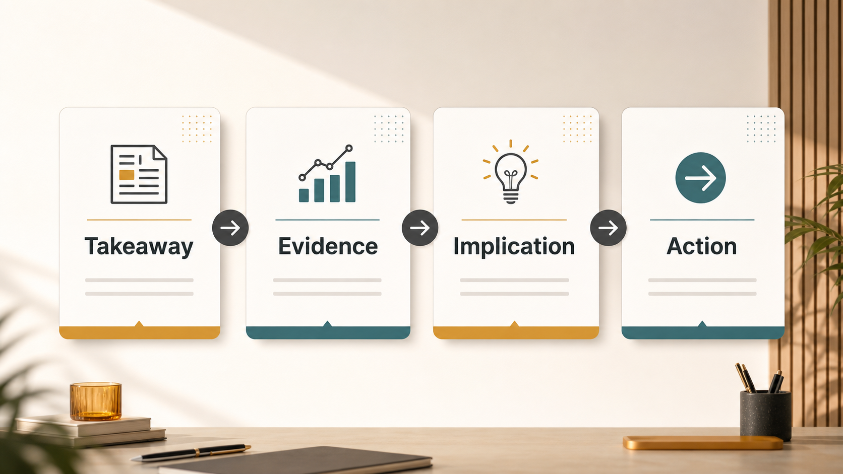
A strong slide answers four questions:
- What is the main takeaway?
- What evidence supports it?
- What does it mean for the business?
- What should happen next?
This boundary matters. An executive summary slide is not the place for every metric, chart, project update, or stakeholder comment. It should prioritize the information that changes the decision.
For leadership audiences, clarity is essential. Executives often scan slides under time pressure, between meetings, or before a live discussion. The slide needs to work even when it is read in 30 seconds.
A Realistic Executive Summary Slide Example
Imagine a quarterly business review for a B2B SaaS company deciding whether to increase investment in its enterprise customer segment.
The slide title is:
Enterprise segment is driving growth, but onboarding capacity is becoming the main constraint
Below it, the slide includes a short summary statement:
Enterprise accounts generated 62% of net new ARR this quarter, with higher retention and expansion than mid-market accounts. However, implementation timelines increased from 41 to 58 days, creating risk for Q3 pipeline conversion.
The slide content is arranged into four blocks: growth performance, customer quality, operating constraint, and recommendation. Enterprise net new ARR reached $1.8M, up 34% quarter over quarter. Net revenue retention was 128% for enterprise accounts versus 106% for mid-market accounts. Average onboarding time increased from 41 to 58 days. The recommendation is to add two implementation managers and prioritize onboarding automation for the top three workflows.
This is a useful executive summary slide because it does not merely say “enterprise performed well.” It explains the tension: the segment is attractive, but the operating model may not support continued growth without investment.
Why This Executive Summary Slide Works
The example works because every part of the slide supports one decision. The headline, metrics, implication, and recommendation all point toward the same business question: should the company invest in enterprise onboarding capacity?
1. The Headline States the Business Takeaway
A weak headline might say, “Enterprise Segment Update.” That label identifies the topic, but not the point.
The stronger headline says, “Enterprise segment is driving growth, but onboarding capacity is becoming the main constraint.” This works because it contains a conclusion. Before reading the details, the executive understands the key tension.
Good executive summary headlines often combine performance and implication. They should reveal the slide’s argument immediately.
2. The Slide Prioritizes Decision-Relevant Evidence
The example uses four content blocks, not ten. That matters because an executive summary slide should filter information, not archive it.
The selected metrics are connected. ARR growth shows upside. Net revenue retention shows customer quality. Onboarding time shows operational risk. The recommendation shows the decision required. Together, they create a complete executive story.
If the slide added every regional breakdown, usage metric, customer quote, and sales activity measure, the main message would be harder to find. Supporting slides can hold detail. The executive summary slide should hold judgment.
3. The Visual Hierarchy Guides Fast Reading
A good executive summary slide is designed for scanning. In the example, the audience reads the headline first, then the summary statement, then the structured evidence, then the decision callout.
This order is created through visual hierarchy. The headline is largest. The summary statement is prominent but brief. The content blocks are grouped evenly. The decision request is visually distinct so it does not disappear into the data.
Visual hierarchy is not decoration. It tells the reader what to process first, what to compare, and where to land.
4. The Slide Connects Evidence to Action
Many executive summary slides fail because they show data without explaining what the data means. Metrics alone rarely create alignment. Decision-makers need the implication.
In this example, longer onboarding time matters because it may slow pipeline conversion. The recommendation matters because it directly addresses that constraint. The slide does not create a vague concern; it frames a specific operational decision.
Common Mistakes in Executive Summary Slides
The most common mistake is treating the slide as a miniature version of the full presentation. This leads to dense text, too many numbers, and a weak main message.
Another issue is using vague titles such as “Q2 Results,” “Market Update,” or “Strategic Initiative Summary.” These may be accurate, but they do not help the audience understand the takeaway.
Some slides also combine unrelated points without explaining the logic between them. Revenue performance, customer satisfaction, hiring status, product roadmap, and brand awareness may all matter, but they should not sit together unless they support one executive decision.
A final mistake is overloading the slide with charts. Charts are helpful when they clarify the argument, but several small visuals can compete for attention. For an executive summary slide, one strong visual is often better than four weak ones.
| Evaluation Area | Ineffective Executive Summary Slide | Effective Executive Summary Slide |
| Headline | Labels the topic | States the business takeaway |
| Content selection | Includes too many details | Prioritizes decision-relevant points |
| Metrics | Reports numbers without context | Links evidence to implication |
| Layout | Crowded and hard to scan | Uses hierarchy and grouping |
| Action | Ends with information | Ends with a clear next step |
How Pi Helps Create Executive-Ready Summary Slides
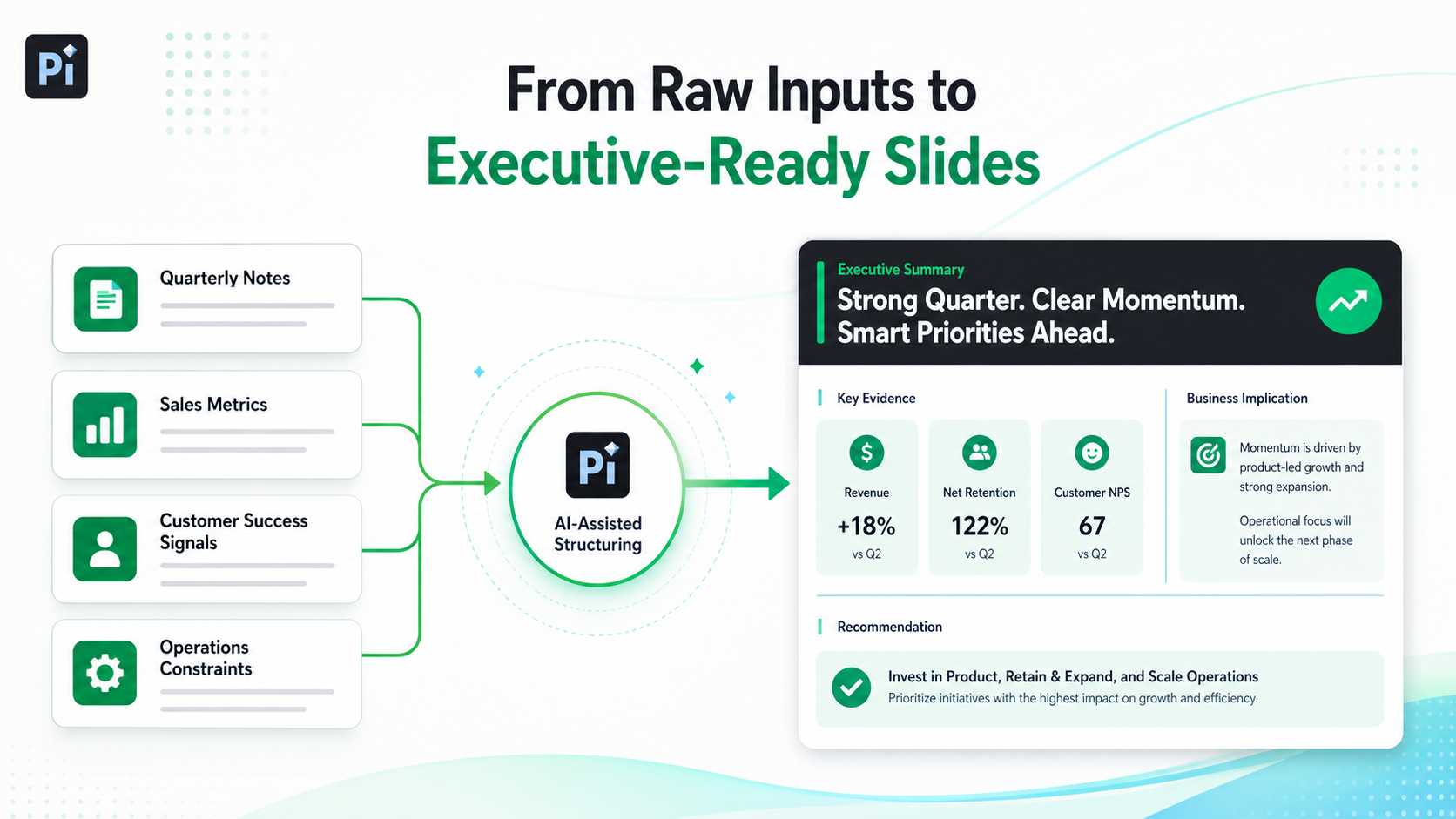
Pi is an AI presentation maker and AI PPT generator built for professional business presentations. For executive workflows, the value is not only faster slide creation. It is the ability to turn raw inputs into structured presentation logic, concise messaging, and business-grade visual quality.
When teams prepare leadership updates, consulting reports, sales decks, strategy reviews, or board materials, they often have plenty of information but not enough clarity. Pi helps organize that information into a slide structure that supports a decision.
1. Business Logic Comes Before Slide Styling
A polished slide is not useful if the argument is unclear. Pi helps teams start with the business logic: the core message, the supporting evidence, the implication, and the recommended action.
This matters for an executive summary presentation because the slide must do more than look professional. It must make the decision easier. Instead of beginning with a blank slide or generic template, teams can work from the actual business question: What is the decision? What evidence matters? What risk or opportunity should leadership understand?
2. Executive Structure Becomes Easier to Build
Executive slides require compression. The challenge is deciding what to remove while keeping the message specific. Pi helps create concise sections, clear hierarchy, and decision-oriented flow so the slide does not become a dense recap.
For example, a team could input quarterly review notes, financial metrics, customer signals, and strategic priorities. Pi can help turn those inputs into a structured executive summary slide with a takeaway headline, grouped evidence, and a clear recommendation.
This is especially useful when multiple stakeholders contribute material. Sales may emphasize pipeline, customer success may emphasize retention, finance may emphasize margin, and operations may emphasize capacity. Pi helps bring these inputs into a coherent presentation rather than a collection of disconnected updates.
3. Premium Visual Quality Supports Credibility
In high-stakes business settings, presentation quality affects trust. A slide with inconsistent spacing, weak hierarchy, or crowded content can make a strong recommendation feel less prepared.
Pi helps create premium, business-grade slides with cleaner layout, stronger alignment, and more professional visual rhythm. The goal is not decorative design. It is credibility, readability, and executive readiness.
Executive Summary Slide Checklist
Before using an executive summary slide in a leadership meeting, review it against a few practical questions:
- Does the headline state the actual takeaway, not just the topic?
- Can an executive understand the main point in less than 30 seconds?
- Are the metrics clearly connected to the business implication?
- Does the slide prioritize three to four key ideas?
- Is there a clear next step, recommendation, or decision request?
Also check the visual structure. The reader should know where to look first, what matters most, and how the evidence supports the conclusion. If the slide requires too much explanation before it makes sense, it is probably not yet executive-ready.
The Verdict: A Strong Executive Summary Slide Makes the Decision Easier
The best executive summary slide example is not the one with the most information. It is the one that makes the business situation clear enough for action.
A strong slide gives executives the takeaway, evidence, implication, and next step in a structure they can scan quickly. It respects their time while still providing enough substance to support judgment.
Whether you build the slide manually or use Pi to accelerate the workflow, the principle is the same: do not compress the whole presentation into one slide. Create a decision-oriented summary that helps leadership understand what matters and what should happen next.
Frequently Asked Questions (FAQ)
Q: What should an executive summary slide include?
A: It should include a takeaway headline, brief summary, key supporting evidence, business implication, and recommended next step.
Q: How long should an executive summary slide be?
A: It should usually fit on one slide and be readable in under 30 seconds, with supporting details placed later in the deck.
Q: What makes an executive summary presentation effective?
A: It connects insight to action by explaining what the data means, why it matters, and what leadership should consider next.
Q: How can Pi help with executive summary slides?
A: Pi helps turn raw business information into structured, executive-ready slides with clear logic, concise messaging, and premium visual quality.
 How Many Slides Do Great Presentations Really Need? A Data-Driven Analysis
 The State of AI Presentation Tools in 2026: Trends, Adoption, and Workflows