How to Add a Border in Google Slides and PowerPoint
Adding a border to a slide is easy. Using one well is what matters. A border for Google Slides or a PowerPoint border can frame important content, organize space, and make a slide feel more intentional. Used poorly, it can make a presentation feel crowded, boxed in, or decorative.
This guide explains how to add borders in both tools and shares practical presentation design tips so borders improve clarity instead of distracting from your message.
When a Slide Border Helps—and When It Does Not
A slide border works best when it supports the layout. It can frame a quote, contain a key takeaway, separate a chart, or give a title slide a finished edge. It can also help minimalist slides feel more grounded when there is a lot of whitespace.
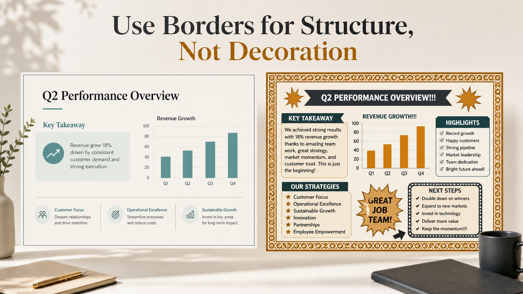
However, a border is not automatically professional. In many business presentations, alignment, spacing, typography, and color already create enough structure. A border should solve a design problem, not fill empty space.
Use a border when it helps:
- Frame a slide or important content block
- Highlight an image, quote, chart, or callout
- Add subtle structure to a minimalist layout
- Create consistency across a section or template
Avoid borders when the slide is already dense, when the outline competes with the content, or when the frame becomes more noticeable than the message. The best borders are usually quiet.
How to Add a Border in Google Slides
Google Slides does not have a dedicated “add slide border” button, but you can create one with a shape.
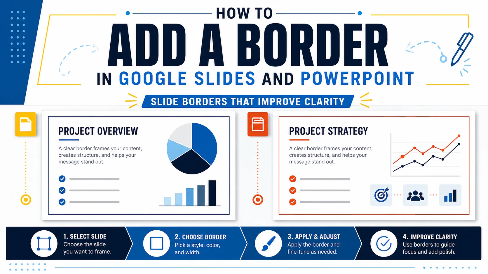
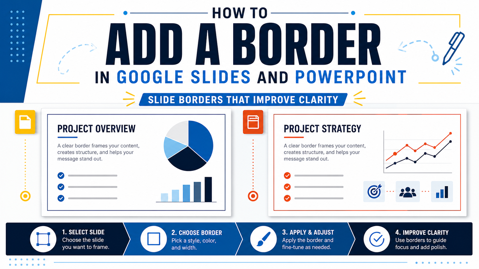
Open your presentation and select the slide where you want the border. Go to Insert, choose Shape, and select the rectangle. Draw the rectangle close to the slide edges. You can adjust the size and position afterward, so it does not need to be perfect immediately.
With the rectangle selected, set the fill color to transparent. This is essential because a filled shape may cover your slide content. Then choose a line color that fits the deck’s palette. For business presentations, muted gray, navy, charcoal, or a restrained brand color usually works better than a bright decorative color.
Next, adjust the line weight. A 1 px or 2 px line is enough for most slides. Title slides or section dividers can sometimes use a slightly thicker border, but restraint usually looks more polished.
Leave a consistent margin between the border and the slide edge. Placing the line directly on the edge can feel cramped or may not display cleanly on every screen. A small margin gives the layout breathing room.
You can use the same method for object borders. Draw a transparent rectangle around an image, chart, quote, or key takeaway to create emphasis without adding a heavy filled box.
How to Add a Border in PowerPoint
Adding a PowerPoint border follows a similar process, with more formatting control.
Open your presentation and select the slide you want to edit. Go to Insert, choose Shapes, and select a rectangle. Draw it around the slide or around the object you want to frame.
With the shape selected, go to Shape Format. Set Shape Fill to No Fill, then use Shape Outline to choose the border color. Adjust the outline Weight to make the line thinner or thicker.
PowerPoint also gives you options for dashes, transparency, line style, and object ordering. If the border covers other content, send it backward. If you want the same border across multiple slides, add it to a slide master or layout so the formatting stays consistent.
The design principle is the same as in Google Slides: the border should support the message. A clean, thin, aligned frame usually looks more professional than a decorative outline with multiple effects.
Border Design Tips for Cleaner Presentations
The best slide borders feel like part of the layout system. They guide attention without demanding it.
Start with thin lines. Thick borders reduce usable slide space and make the design feel heavier. If a border needs to be thick to be visible, the slide may need a clearer layout instead.
Preserve whitespace. Text, charts, and images should not sit too close to the border. A frame should create order, not make content feel trapped.
Match the border color to the rest of the deck. If your palette uses dark blue, light gray, and white, the border should come from that system. Random accent colors can make the slide feel less controlled.
Use borders selectively. A title slide, quote slide, section divider, or key insight slide may benefit from a border. A dense data slide often does not. Consistency matters, but consistency does not mean every slide needs the same outline.
Finally, align precisely. Uneven margins are easy to notice. Whether you use Google Slides or PowerPoint, take a moment to position the rectangle carefully.
Google Slides vs PowerPoint for Border Formatting
Both tools can create clean borders. The difference is not whether you can add one, but how much control you need.
| Border Formatting Need | Google Slides | PowerPoint |
| Full-slide border | Easy with a transparent rectangle | Easy with stronger layout controls |
| Line weight | Basic control | More detailed control |
| Border color | Simple to apply | Simple with advanced options |
| Object borders | Good for callouts and images | Good with more style flexibility |
| Alignment precision | Suitable for quick edits | Better for polished templates |
| Best use case | Fast, simple slide updates | Business decks needing tighter consistency |
For quick edits, Google Slides is usually enough. For more controlled formatting across a professional deck, PowerPoint offers deeper options.
A Better Way to Think About Borders in Professional Decks
In professional presentations, borders should serve hierarchy and communication. They can show that a quote matters, that a chart belongs to a specific section, or that a slide is a transition point. But a border is only one part of a larger system.
For teams building pitch decks, sales decks, consulting reports, executive presentations, brand proposals, market research decks, or product launch decks, the real challenge is rarely drawing a rectangle. The harder task is making structure, narrative, layout, and visual style work together.
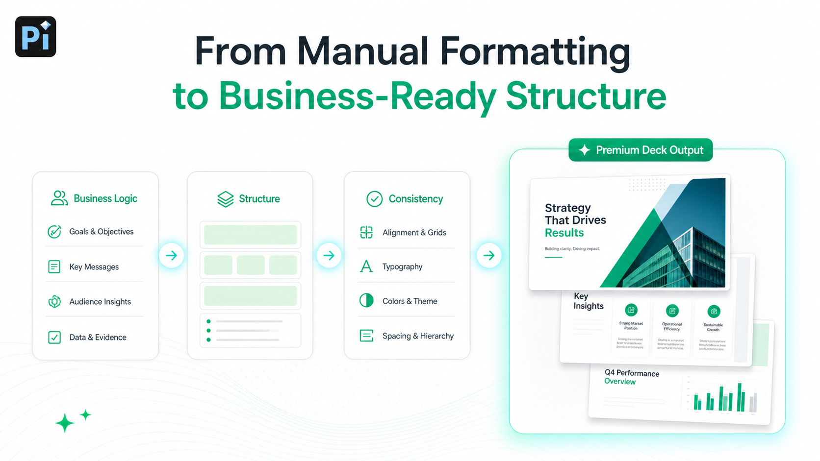
Pi, short for Presentation Intelligence, is built for that broader workflow. It is an AI presentation maker and AI PPT generator for professional business presentations, helping teams move beyond manual decoration toward business-ready presentation systems.
A polished deck starts with the message. Before deciding whether a slide needs a border, the team needs to know what the slide is supposed to do. Is it introducing a problem, proving market traction, comparing options, explaining risk, or asking for a decision? Pi helps structure presentations around business logic first, so design choices support the argument instead of becoming isolated styling decisions.
Consistency also matters. Manual borders can become inconsistent quickly: one slide has a thick outline, another uses a different margin, and another uses a slightly different color. These small differences make the deck feel less deliberate. Pi helps teams create consistent visual systems across the full presentation, where spacing, hierarchy, typography, and visual quality work together.
Google Slides and PowerPoint are useful for manual edits when you already know what to change. But high-stakes presentations often require more than formatting control. When a deck needs to influence investors, executives, customers, or partners, structure and business logic matter as much as visuals. Pi supports these workflows with Multi-Agent AI, professional structure, and business-grade aesthetics.
Practical Verdict: Use Borders as Structure, Not Decoration
A border can improve a slide when it adds focus, organizes space, or frames important content. Google Slides and PowerPoint both make this easy with transparent rectangle shapes, outline colors, line weights, and alignment tools.
For simple edits, manual borders are enough. Use thin lines, consistent margins, restrained colors, and generous whitespace. Avoid heavy decorative frames unless the style clearly fits the audience and purpose.
For professional decks, think beyond the border itself. The best presentations use every design element to support hierarchy, readability, and business communication. If the border helps the audience understand the message faster, keep it. If it only fills space, remove it.
Frequently Asked Questions (FAQ)
Q: How do I add a border for Google Slides? A: Insert a rectangle shape, place it near the slide edges, set the fill to transparent, then choose a line color and line weight. Use a thin border and consistent margins.
Q: How do I add a PowerPoint border? A: Insert a rectangle from the Shapes menu, set Shape Fill to No Fill, then adjust Shape Outline color and weight. You can use it for a full-slide frame or an object border.
Q: Do borders make slides look more professional? A: Not automatically. Borders look professional when they improve structure, focus, and readability. If they make the slide feel crowded, remove them.
Q: How thick should a slide border be? A: For most business presentations, 1 px or 2 px is enough. Use thicker borders only for title slides, section dividers, or special emphasis.