PPT Slide Dimensions: A Practical Guide for Better Layouts
Choosing the right PPT slide dimensions is not just a technical setup step. It shapes how your content reads, how visuals fit, how charts scale, how exports behave, and how professional the final presentation feels in front of an audience.
Many layout problems begin with the wrong slide size: text feels cramped, images get cropped, charts become unreadable, or black bars appear on a projector. These issues are often blamed on design, but the real cause is usually the canvas. When you choose the rightPowerPoint dimensionsbefore you design, the rest of the presentation layout becomes easier, cleaner, and more reliable.
What PPT Slide Dimensions Actually Mean
PPT slide dimensions refer to the size and shape of the slide canvas in PowerPoint. That canvas defines the working space for every title, chart, image, icon, and text box in your deck.
There are three related ideas to understand. Physical dimensions describe the slide in units such as inches or centimeters. Pixel dimensions matter when exporting slides as images or displaying them on screens. Aspect ratio describes the relationship between width and height, such as 16:9 or 4:3.
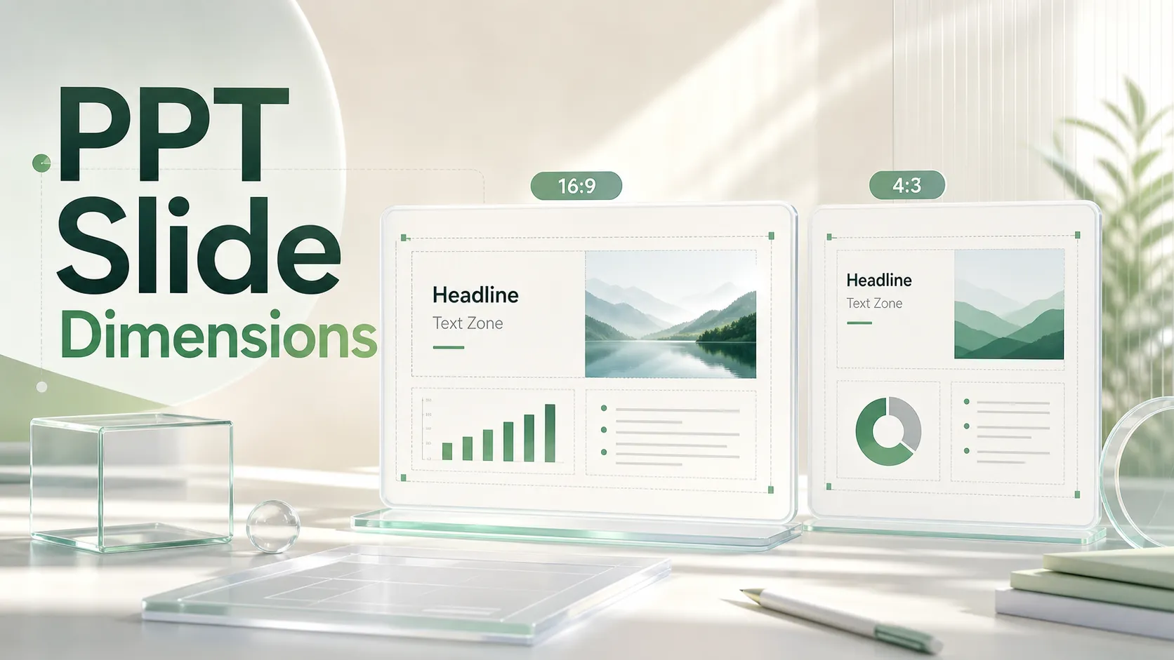
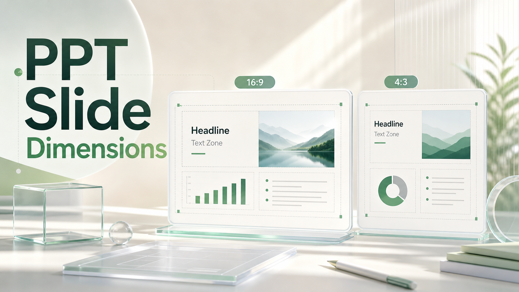
For most screen-based presentations, aspect ratio is the most important concept. A 16:9 slide is wide and modern, while a 4:3 slide is closer to a square. The exact inch measurement may vary, but the ratio determines how the slide fills a monitor, projector, or video meeting window.
This is why slide size should be decided early. If you build a full deck in one format and change the dimensions later, PowerPoint may scale objects unevenly, shift alignment, crop images, or create awkward whitespace.
Common PowerPoint Dimensions and When to Use Them
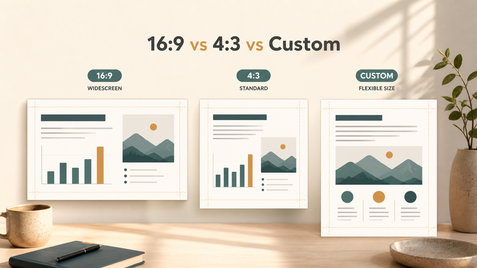
The most common modern format is 16:9 widescreen. It fits most laptops, conference room displays, large monitors, webinars, and video calls. For business presentations, sales decks, executive updates, product launch decks, and pitch decks, 16:9 is usually the safest starting point.
The older 4:3 standard still appears in some classrooms, legacy projectors, government rooms, and older conference setups. It can also be useful when a presentation will be printed or viewed in environments where older hardware is still common. However, on modern widescreen displays, 4:3 slides often leave empty bars on the sides.
Custom slide sizes are useful for specific outputs. A team may create print-friendly decks, portrait handouts, digital signage, social media summaries, or PDF reports that need a different canvas. Custom formats can work well, but they require more planning because they may not display cleanly across every screen.
PowerPoint itself works well across these formats. The challenge is not whether the software can support a slide size. The challenge is whether the chosen dimensions support the audience, content, and delivery environment.
How Slide Size Affects Presentation Layout
Slide dimensions influence layout more than many presenters expect. A wider slide gives you more horizontal space for comparisons, timelines, process flows, and dashboards. A narrower slide can make dense content feel taller and more compressed.
Text density is one of the first things affected. A 16:9 slide can handle a headline, visual, and concise supporting points with more breathing room. A 4:3 slide may require shorter lines, fewer columns, and more selective content. If the same amount of text is forced into both formats, one version will usually feel more crowded.
Charts are also sensitive to slide size. Wide slides are better for line charts, bar comparisons, market maps, and multi-column analysis. Smaller or squarer slides can make axis labels, legends, and callouts harder to read. When charts are central to the message, the slide dimensions should allow the audience to understand the insight quickly.
Images behave differently across ratios. A full-bleed photo that looks strong in 16:9 may be cropped awkwardly in 4:3. A vertical product image may feel lost on a wide canvas unless it is paired with text, data, or supporting visuals. Good presentation layout means selecting images that fit the canvas instead of stretching visuals to fill space.
Whitespace is another major factor. Larger horizontal space does not mean every inch should be used. Strong slides rely on hierarchy: headline, main idea, supporting evidence, and visual emphasis. The right dimensions give the designer room to create focus rather than simply add more content.
Choosing the Right Slide Size Before You Design
The best slide size depends on where the deck will live. Before designing, consider the real use case instead of choosing dimensions by habit.
Ask a few practical questions:
- Will the presentation be shown on a modern widescreen display or an older projector?
- Will it be shared mostly as a PDF after the meeting?
- Does it need to be printed as a handout or read on paper?
- Is the content mostly visual, data-heavy, text-heavy, or discussion-led?
- Will the deck be used in video calls, conferences, classrooms, or boardrooms?
For modern business meetings and remote presentations, 16:9 is usually the most practical choice. For older classrooms or venues with legacy projection systems, 4:3 may still be safer. For PDF reports, printed leave-behinds, or proposal documents, a custom or print-friendly format may be more appropriate.
The key is to design for the final environment. A deck that looks polished on a laptop may not work on a distant conference screen. A slide that looks readable as a PDF may feel too dense when projected. Slide size is not only about the file; it is about the audience experience.
A Quick Comparison of Common Slide Dimensions
| Slide Format | Typical Dimensions | Best Use Case | Layout Consideration |
| 16:9 widescreen | 13.333 × 7.5 in | Business meetings, webinars, modern screens | Strong for wide visuals and charts |
| 4:3 standard | 10 × 7.5 in | Older projectors, some classrooms | Less horizontal space; watch text density |
| Custom size | Varies by output | Print, PDF reports, signage, special formats | Requires planning for display and export |
Layout Mistakes Caused by the Wrong Slide Size
One of the most common mistakes is changing slide dimensions after the deck is already designed. PowerPoint can resize elements, but it cannot always preserve visual judgment. Objects may shift, charts may become distorted, and carefully balanced layouts may need manual repair.
Another mistake is using the wider canvas as an excuse for too much content. A 16:9 slide gives more room, but that space should support clarity, not clutter. If every slide becomes a dense document, the audience will stop listening and start reading.
Safe margins are also easy to ignore. Text placed too close to the edge can feel unstable, and some screens or projectors may crop the outer area slightly. Leaving consistent margins helps slides feel intentional and protects important content.
Image stretching is another visible problem. When visuals are forced into a different aspect ratio, people, products, charts, and backgrounds can look distorted. Cropping is often better than stretching, but it should be done deliberately.
Finally, many teams design only for their own screen. A deck may look perfect on a designer’s monitor but fail in a conference room, video call, or exported PDF. Professional presentation layout needs to consider multiple viewing conditions.
How Pi Helps Teams Build Better Presentation Layouts

Pi, short for Presentation Intelligence, is an AI presentation maker built for professional business presentations. It is not simply about choosing slide dimensions. It helps teams create structured, polished decks where layout decisions support the business message.
1. Business Logic Comes Before Slide Styling
In high-stakes decks, the main issue is rarely just whether the slide is 16:9 or 4:3. The harder question is what the slide should communicate. Pi helps organize ideas into a clear business narrative so each slide has a purpose, not just a format.
This is especially useful for pitch decks, sales decks, consulting reports, executive presentations, brand proposals, market research decks, and product launch decks. The structure guides the layout, rather than forcing content into decorative templates.
2. Professional Structure Supports Better Visual Hierarchy
Good presentation layout depends on hierarchy. The audience should know what to read first, what matters most, and what evidence supports the message. Pi helps teams move from raw content to professional slide structure, reducing the risk of crowded pages and unclear takeaways.
This matters when a deck contains strategy, metrics, customer insights, competitive analysis, or financial content. The slide dimensions provide the canvas, but the hierarchy determines whether the canvas works.
3. Premium Visual Quality Reduces Manual Formatting
Teams often spend too much time adjusting alignment, spacing, image placement, and chart balance. Pi supports a more polished workflow by combining Multi-Agent AI, business-ready structure, and premium visual quality.
The result is not that slide dimensions stop mattering. They still do. But dimensions become part of a broader presentation system where message, layout, and design quality work together.
Best Practical Choice for Most Presentations
For most modern screen-based presentations, 16:9 is the best default. It fits current laptops, monitors, video calls, conference displays, and many large-format screens. It also gives teams more flexibility for visual storytelling, side-by-side comparisons, and chart-heavy business content.
That said, 16:9 is not always the right answer. If your deck will be shown on an older projector, used in a classroom with legacy equipment, printed as a formal handout, or exported as a document-style PDF, another slide size may be better.
The practical rule is simple: choose the slide size before you design, and choose it based on where the presentation will be viewed. The right PowerPoint dimensions make your layout easier to read, easier to export, and more professional in the room.
Frequently Asked Questions (FAQ)
Q: What are the standard PPT slide dimensions? A: The most common modern PPT slide dimensions are 13.333 × 7.5 inches for 16:9 widescreen. The older 4:3 standard is often 10 × 7.5 inches.
Q: Is 16:9 better than 4:3 for PowerPoint presentations? A: 16:9 is usually better for modern business presentations, video calls, and widescreen displays. 4:3 can still be useful for older projectors, some classrooms, and certain print-focused use cases.
Q: Does changing slide size affect my presentation layout? A: Yes. Changing slide size after designing can shift objects, crop images, distort spacing, and weaken visual hierarchy. It is better to choose the slide size before building the deck.
Q: What is the best slide size for business presentations? A: For most business presentations, 16:9 widescreen is the safest choice. However, the best slide size depends on the final environment, including the screen, projector, PDF export, or print format.